AN IMPORTANT PRIVATE COLLECTION OF WORKS BY MARGARET PRESTON
IMPORTANT INDIGENOUS ART
In 1925 Margaret Preston expressed a desire to rid herself of the mannerisms of a European inspired art education; to embrace, instead, a native-born art based on ’the art of a people who had never seen or known anything different from themselves.’ The exemplars in Australia were, of course, ‘the Australian aboriginals, and it is only from the art of such people in any land that a national art can spring’.1 Ironically, her argument for the development of a purely Australian aesthetic relied heavily on the example set in Europe: ‘Would France be now at the head of all nations in art if her artists and craftsmen had not given her fresh stimulus … by benefiting from the art of her native colonies?’.2 Regardless of its slippery premise, Preston’s argument points insightfully to the refined synthesis of Indigenous and European design she was to achieve over the following decades.
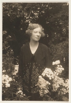
MARGARET PRESTON AT HER HOME IN MOSMAN, 1924.jpeg
New South Wales
In France in the summer of 1913 Preston was ‘trying all I can to reduce my still lifes to decorations’.3 In the prewar context ‘decoration’ did not refer to ‘décor’ but to art – Matisse’s for example – that was based on composition, shape and colour rather than subject alone.4 Finding it ‘fearfully difficult’ to reduce her subjects in such a way using the medium of oil paint, she found a way through the impasse in wood-block printing: ‘for the wood hinders facility and compels the worker to keep forms in his composition severe’.5 The play of vertical, horizontal and checked lines in Still Life – Basket, 1925 displays her development of a wood-blocking technique that broke the composition into geometric shapes and planes. Here the viewer is presented with an agreeably flat image that also steps back handsomely in space. The style at once emulates Aboriginal design, Cezanne’s abstraction and Japanese art.Preston’s paintings took a stark cue from her prints and she was soon experimenting widely within her austere and refined new style. The style of Banksia on Window Ledge, 1934 is her own Australian-inflected version of post-Cubist geometric abstraction. She had found the bold cylindrical shape of the Australian banksia flower a positive gift to the ’laboratory table’ on which she tested new styles of representation.6 Additionally, in this work, she has inserted a cheeky contemporary reference to one of George Lambert’s favourite motifs, the white glove, and paired it suggestively with a desiccated banksia flower (an unusual note – she is not known for such quips). Preston extolled native flowers for their ’tremendous difference … always stark, never juicy, sometimes flaring in colour but never with the tenderness of the rose’.7 To Preston they more than symbolised the Australian landscape: they were the landscape. The glimpse of outdoors caught in Banksia on Window Ledge emphasises the relationship between the banksia and the sunburnt country. The painting’s stark palette, geometric composition, and firm black lines speak of an artistic confidence earned through years of trial and error at the laboratory table, while the tantalising snippet of the world outside the domestic interior points to Preston’s way out of the ’flowery cul-de-sac’ of still life experimentation.8
Kangaroos Feeding, 1945 is reminiscent of the bark art of Northern Australia. Like Byram Mansell’s contemporaneous bark designs, it shows Preston folding her experimentation with geometric abstraction into her growing knowledge of Aboriginal visual culture to express an Aboriginalised landscape. Here the familiar Cezannesque technique of breaking the subject into distinct planes and shapes has been married to the in-filled stripes of Indigenous clan designs. The composition is looser than previous work, less austere: familiarity had relaxed her. The result is a jostling patchwork of tones and forms, each given a firm black outline but all working together to create a sense of a landscape in action. The kangaroos are given no more attention than the earth they stand on, they are no more active than the oblique lines of light and shadow: all is one form. Oneness is something she admired in the work of Indigenous artists: ‘features have never attracted him, it is always the whole’.9 A similar effect is created in the faded dashes of colour filled with light in the wonderfully watery monotype Pandanus, Elsey Falls, 1946 where trees, rocks and water shimmer and stare under the bleaching Australian sun.
Preston had numerous opportunities to study Aboriginal art. The rock carvings and cave paintings of the Ku-ring-gai and Darug people found in the Berowra Waters district where she lived with her husband from 1932 were a primary source of inspiration. In 1940, in her mid-sixties, she travelled with Bill over rough country to remote sites in Arnhem Land, Kakadu and the Kimberly to see rock art. Writing about the experience in Art in Australia later that year she regretted that the remoteness of many rock art sites had restricted their influence on the development of a national aesthetic based on Indigenous art.10 One way she saw of overcoming this was through museum collections, books and through firsthand accounts, such as her own, in journals such as Art in Australia, The Home, and London’s Studio. Preston took advantage of secondary sources herself. She recommended the ethnologist Frederick D. McCarthy’s book Australian Aboriginal Art and retained a memory of his illustrated essay ‘Aboriginal Art’ from a 1939 Art in Australia.11 The predominantly black and white Happy Family, 1949, frankly based on a photograph from a rock art site in the Kimberley, captures the real-life effect of the Wandjinas as staring guardians of place, unlike the composite of rock paintings illustrated in McCarthy’s essay where the Wandjinas are gentled into picture-book medieval knights in chain-mail. Such was Preston’s reforming art. She had held onto McCarthy’s article for a decade!12
Works such as Aboriginal Still Life, 1946 and Happy Family are examples of Preston’s most direct emulations of Indigenous design. Her use of earth tones mimics the red and yellow ochres, the white gypsum and black charcoal she admired in the work she has seen on her trip to the Northern Territory: ’As he is an earth spirit, he reasons that there is no green or blue earth, so why use other than earth colours?’.13 It is interesting that the elements she admired and emulated most from Indigenous art – the balanced geometrical designs that are never duplicated, the ’strong outlines and clean, unmuddled colour’ – are characteristics she also admired in early Italian art, which to me suggests that she was aware of the synthesis between European and Indigenous influences taking place in her art and outlook.14
1. Preston, M., ‘The Indigenous Art of Australia’, Art in Australia, Sydney, 3rd series, no. 11, March 1925, unpaginated
2. ibid.
3. Margaret Preston in a letter to Norman Carter from France in 1913, quoted in Eagle, M., ‘Recall to Order’, Australian Modern Painting Between the Wars 1914-1939, Bay Books, Sydney, 1989, p. 80
4. Eagle, M., ibid., p. 79
5. Preston, M., quoted in Long, G., ‘Some Recent Paintings by Margaret Preston’, Art in Australia, Sydney, 3rd series, no. 59, May 1935, p. 18
6. Mimmocchi, D., ‘Still-life as laboratory table’, Sydney Moderns: Art for a new world, exhibition catalogue, Art Gallery of New South Wales, Sydney, 2013, pp. 199 – 203
7. Preston, M., ‘Influence of Aboriginal Art’, Studio, London, October 1942, p. 122. Also quoted in Eagle, M., ‘National Identities’, Australian Modern Painting Between the Wars 1914-1939, Bay Books, Sydney, 1989, p. 67
8. Eagle, M., ibid., p. 64
9. Preston, M., ‘Influence of Aboriginal Art’, p. 122
10. Preston, M., ‘Paintings in Arnhem Land’, Art in Australia, Sydney, 3rd series, no. 81, November 1940, p. 61 – 63
11. McCarthy, F. D., ‘Aboriginal Art’, Art in Australia, Sydney, 3rd series, no. 77, November 1939, pp. 53 – 62. Preston also contributed to the November 1939 issue and mentions McCarthy’s book in ‘Paintings in Arnhem Land’ in 1940.
12.‘A Composite of Rock Paintings by Australian Aborigines’, Art in Australia, Sydney, 3rd series, no. 77, November 1939, p. 57
13. Preston, M., ‘Paintings in Arnhem Land’, p. 66
14. Preston, M.,‘Paintings in Arnhem Land’, p. 61
HESTER GASCOIGNE
RETURN TO CATALOGUE