IMPORTANT PRINTS FROM THE GROSVENOR SCHOOL
He is a small man with very bright eyes, little bits of side-curls, and one feels instantly at one’s ease with him. During the summer he lives in a cave in France, a very attractive cave, apparently … and in the winter he comes out of his cave to teach lino-cutting to students of the Grosvenor School.1
This is how the Australian modernist, Dorrit Black, described her teacher Claude Flight, the Englishman who revolutionised printmaking in the 1920s and 30s through his passionate advocacy of the colour linocut. Born in London in 1881, Flight came to art late, enrolling at Heatherley’s School of Art at the age of thirty-one after working in a series of varied professions including bee keeping, farming and engineering. His first colour linocuts were produced around 1919 and, in keeping with the prevailing fashion, used powdered pigment mixed with water brushed onto the printing block in the Japanese style, the aim, to achieve images with delicate colour saturation and subtle gradations of tone that mimicked the effects of watercolour. Soon after however, Flight began to experiment and the first of his colour prints using oil-based inks applied to the linoblock with a hard roller (resulting in denser solid colour) were exhibited in the annual exhibition of the Seven and Five Society in the early 1920s.2
One of Flight’s best-known prints, Speed, c.1922, was first exhibited in 1922 and exemplifies both his technical and philosophical approach. Combining a boldly designed image in four colours – cobalt blue and yellow ochre (oil paint), vermilion and Prussian blue (printing ink) – from four carved blocks, it is unusual in that it was printed on the reverse of the sheet, the fine translucent paper allowing the colour to show through to the front.3 Depicting red double-decker buses speeding through a London street, walking figures dwarfed by tall buildings that bend and curve, it evokes the movement and dynamic pace that he perceived as characterising twentieth century life. Flight saw the colour linocut as the modern medium for the modern age, writing that, ‘Time seems to pass so quickly now-a-days. Everybody is in a hurry … this speeding up of life in general … is one of the interesting and psychologically important features of to-day … everybody is on the rush either for work or pleasure: business is hustle, the Cinema, all movement … The Painter cannot but be influenced by the restlessness of his surroundings’.4
GROSVENOR SCHOOL (2) - Supplementary Image copy.jpg
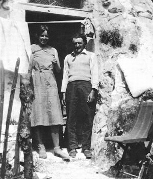
CLAUDE FLIGHT AND
EDITH LAWRENCE OUTSIDE
FLIGHT’S ‘CAVE’ RESIDENCE
AT CHANTEMERLE, NEAR PARIS,
FRANCE, c.1926
courtesy of Parkin Gallery, London
Located in Pimlico in central London, the Grosvenor School of Modern Art was founded in 1925 by Scottish artist, Iain Macnab. It had a decidedly modern outlook, aiming to ‘encourage students to express their own individual ideas rather than be forced to accept worn-out academic theories’5 and to that end, Macnab established a small, hand-picked team of teachers whose forward-thinking ideas matched his own. Various classes were offered, including life drawing, painting, composition, lithography and etching, and from 1926 – 30 Flight taught the art of colour linocutting one afternoon per week. In addition to teaching, he enthusiastically promoted the colour linocut through numerous publications including, Lino-Cuts. A Hand-Book of Linoleum-Cut Colour Printing (1927), the first major book on the subject which quickly became the standard manual used by artists across the world. Flight was tireless in his promotion of the medium, organising almost annual exhibitions of his and his students’ work between 1929 – 37 in London and touring shows which travelled to regional galleries across Britain, as well as to venues in the United States, China and Australia. The medium received the official stamp of approval in 1929 when prints were purchased from the first group exhibition at London’s Redfern Gallery for the collections of the British Museum and Victoria and Albert Museum in London.
Two of Flight’s colleagues at the school, Cyril Power, an architect and fellow teacher, and Sybil Andrews, the School secretary, joined him in his enthusiasm and commitment to the medium, each becoming skilful exponents of the colour linocut whose work is now highly prized. Power’s c.1932 print, The Tube Station, sits alongside Flight’s Speed in its depiction of a subject that is quintessentially London. A station master waves a full train off on its journey through the Tube, the lights and shadows of the platform creating a crisp geometric pattern that is combined with a series of sweeping curves to once again communicate a strong sense of energy and movement in the image. The Tube Station was printed in five colours – sometimes overlaid to create more variety and depth of colour – and produced in two editions, the first around 1932 numbering sixty impressions, and the second of the same size made for successful exhibitions in America about 1935.
The original print has often been described as a democratic artform, its identical (or near identical) and multiple versions – typically limited in quantity and numbered by the artist – making it more affordable and accessible than unique works of art. Flight imagined that as well as being the medium most suited to contemporary life, the colour linocut would adorn the walls of every home and flat, writing that, ‘Linoleum-art colour prints could be sold … at a price which is equivalent to that paid by the average man for his daily beer or his cinema ticket’.6 While Flight’s prints cost much less than a watercolour or more expensive oil painting, typically selling for 2-3 guineas each during the late 1920s, they were still however only within the reach of the middle and upper classes.
Unusually, the Grosvenor School didn’t offer fixed terms but allowed students to join classes at any time during the year and to stay for as long, or short a time, as they wished. This must have been appealing for foreign students and is surely one of the reasons why so many Australians joined the ranks of Grosvenor School alumni. After studying at the South Australian School of Arts and Crafts and later with Julian Ashton in Sydney, Dorrit Black travelled to England in late 1927, attending classes with Flight for several months and absorbing his example of the use of bold colour, the reduction of subject matter to simplified shapes, and patterns based on a dynamic system of opposing rhythmic lines and forms. Bush Wind Mill, 1927 – 28 (sometimes titled The Windmill) depicts a simple, handmade structure Black knew from a friend’s farm in Western Australia and, pictured beside a small timber outbuilding in the shadow of a tank stand, it proudly declares its rural Antipodean origins. Although this print is said to have been produced in an edition of fifty, as was often the case with relief prints (linocuts and woodcuts) by Australian artists at the time, it is unlikely that the entire edition was ever completed. This is an especially rare print by Black, the only catalogued public holding of it being in the Art Gallery of South Australia.
In 1928 Eveline Syme purchased a copy of Flight’s 1927 book from the Arts and Crafts Society of Victoria and in it, discovered ‘something new and different, lino-cut no longer regarded as a base form of woodcut, but evolved into a distinct branch of 20th Century Art’. She continued, ‘I had seen nothing more vital and essentially modern in the best sense of the word than the reproductions in this book’.7 Soon after she enrolled in linocut classes at the Grosvenor School, following her friend Ethel Spowers who had enrolled at the end of 1928. One of only twenty-five catalogued linocuts by Syme, Sydney Tramline, 1936 uses three colours to describe the path of a tram along a steep Sydney road, past factories, high-rise apartment blocks and terrace houses, terracotta coloured rooftops contrasting with the vivid green of the trees. Creating some of the most lyrical colour linocuts of the period, Ethel Spowers followed Flight’s example of depicting movement, but rather than the speed of the modern machine age, her imagery focussed on slower and more gentle motion, such as sinuous plumes of smoke from picnickers campfires rising through the air as seen in Bank Holiday, 1935 (National Gallery of Victoria, Melbourne) and the sudden blast of air that has sent a bundle of papers flying from the hands of the figure depicted in the delightful print, The Gust of Wind, 1930 – 31.
Although each of Flight’s Australian students found their own subjects and developed a distinctive approach to the medium, together they were instrumental in bringing the ideas and techniques of the colour linocut to Australia and contributing to what was a vital thread within modernism in this country.
1. Black, D., quoted in Coppel, S., Linocuts of the Machine Age: Claude Flight and the Grosvenor School, Scolar Press in association with the National Gallery of Australia, Aldershot, 1995, p. 13
2. Coppel, ibid., p. 12
3. Impressions of Speed were sometimes mounted on yellow-toned paper which shifted the appearance of the printed colours. All technical and edition information in this essay is drawn from the catalogue raisonné by Stephen Coppel, ibid.
4. Flight, C., ‘Dynamism and the Colour Print’, The Original Colour Print Magazine, 2, 1925, p. 56 quoted in Coppel, ibid., p. 17
5. Grosvenor School prospectus quoted in Coppel, ibid., p. 12
6. Flight, C. quoted in Coppel, ibid., p. 19
7. Syme, E., quoted in Butler, R., Printed: Images by Australian Artists 1885-1955, National Gallery of Australia, Canberra, 2007, p. 199
KIRSTY GRANT
BACK TO CATALOGUE